Winky Protein Pudding
Collaborated with brand strategists and designers to reposition Winky Protein Pudding as a quality-driven, better-for-you choice in a crowded functional food market. The project centered on closing the gap between the product's genuine quality and how it was being perceived on shelf.
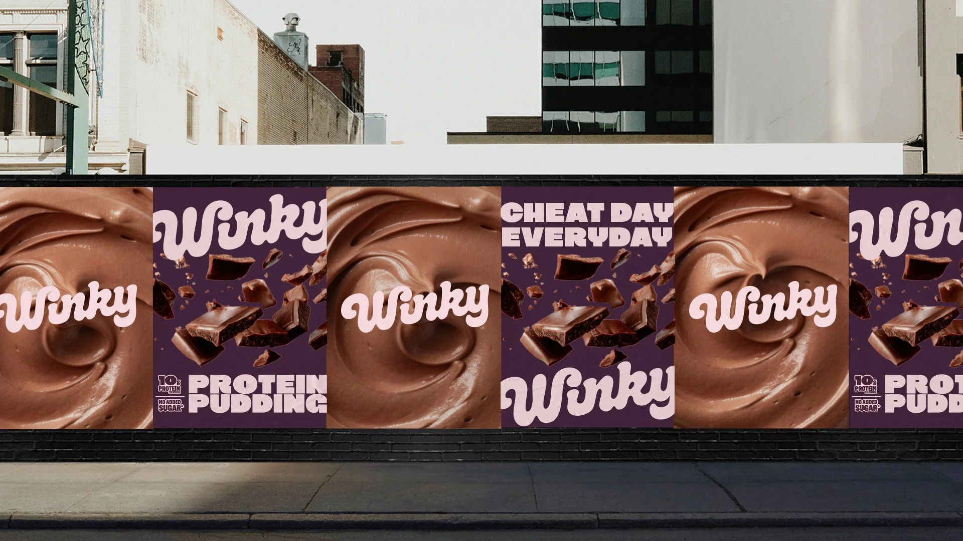
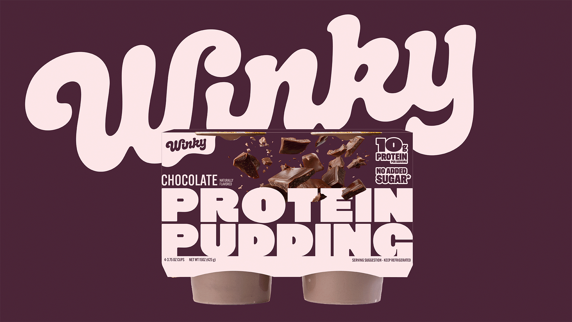
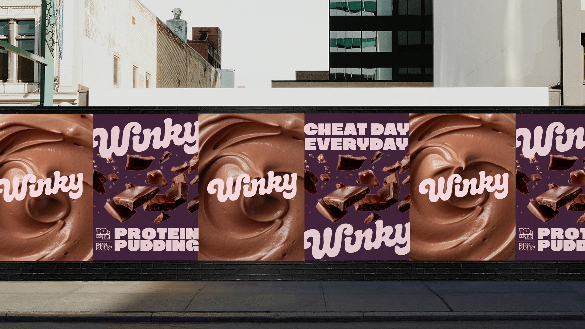
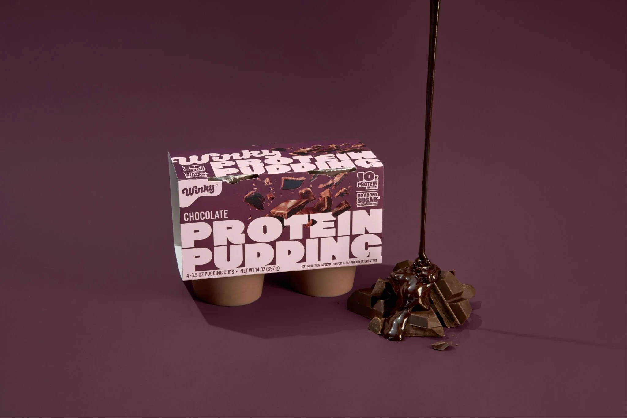
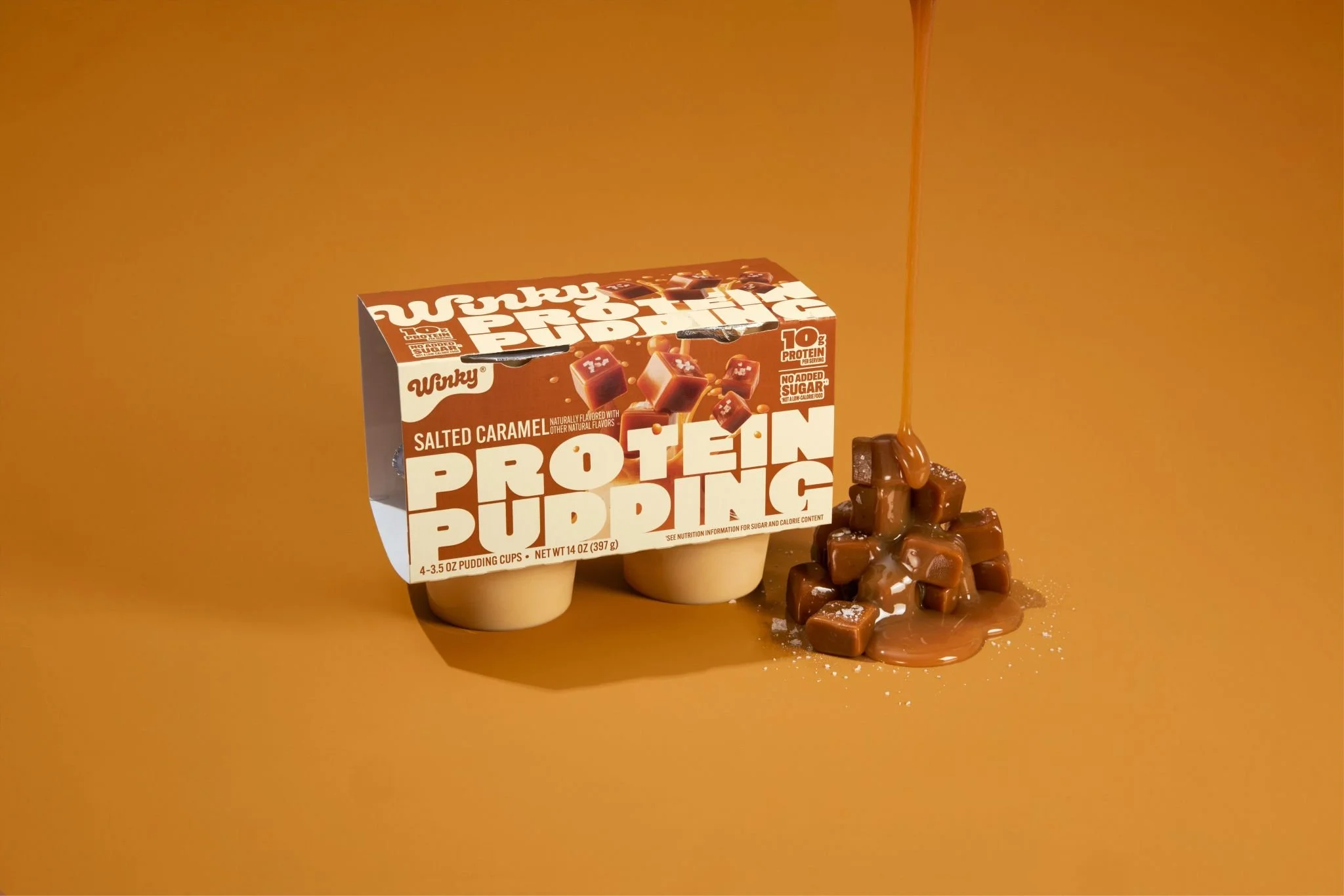
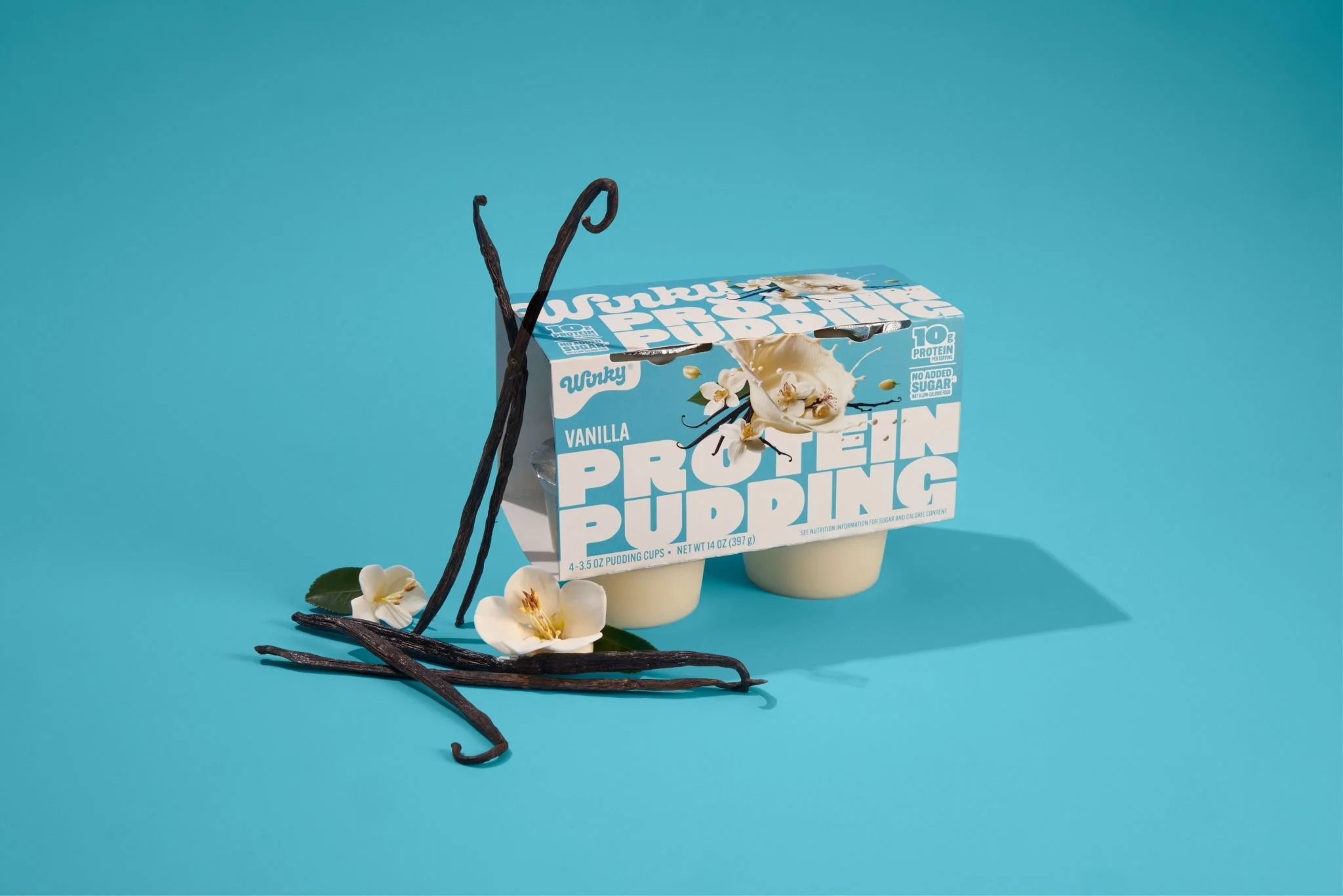
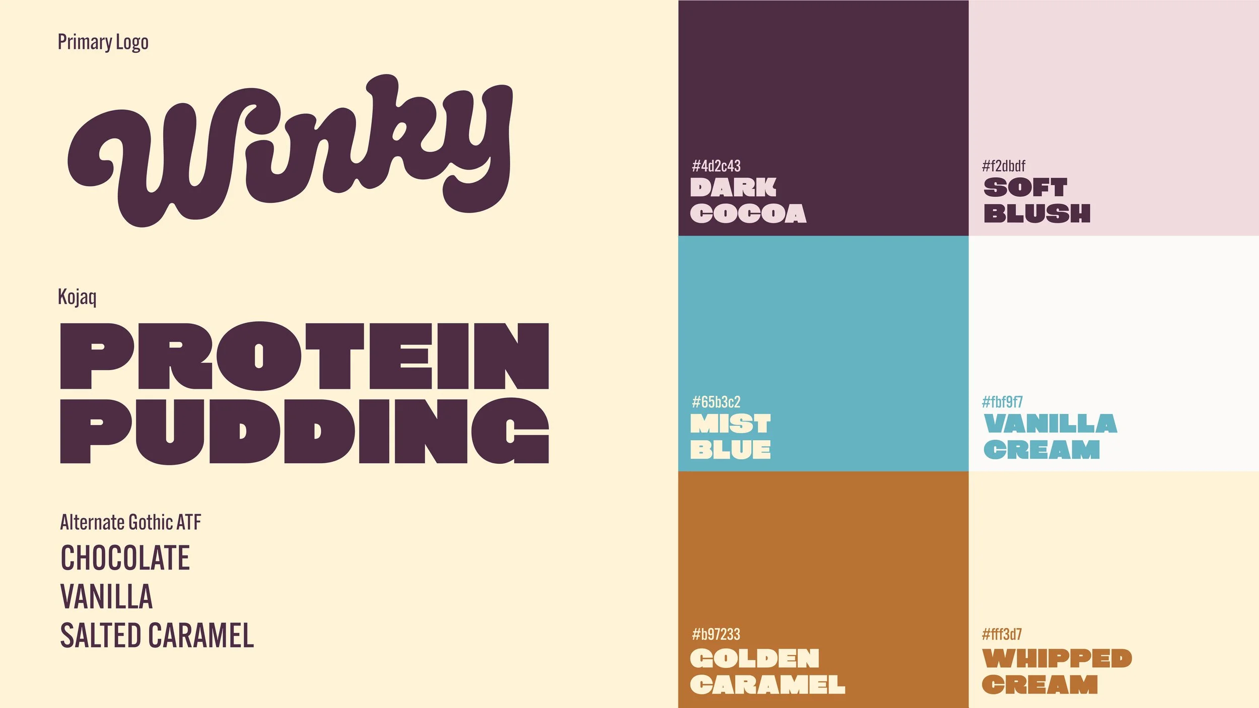
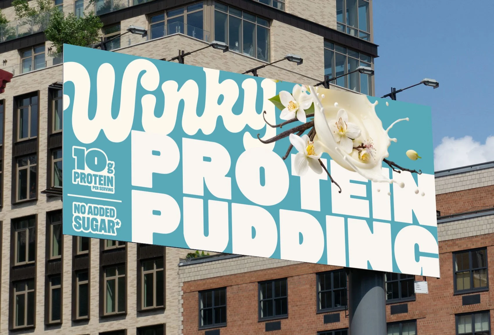
Led the light brand refresh and full packaging design, beginning with establishing a clear art direction rooted in a flavor-forward philosophy. Sourced and edited on-pack imagery to bring appetite appeal and authenticity.
Developed a cohesive color and typographic system designed to signal more premium while remaining approachable and bold across SKUs. Every design decision was made with both brand integrity and compliance in mind, ensuring all packaging met regulatory requirements and was delivered as print-ready files.
-
Successfully completed consumer testing and research validation with target demographic
-
Production-ready packaging system across full SKU range
Market-tested design system positioned for premium category entry

Process
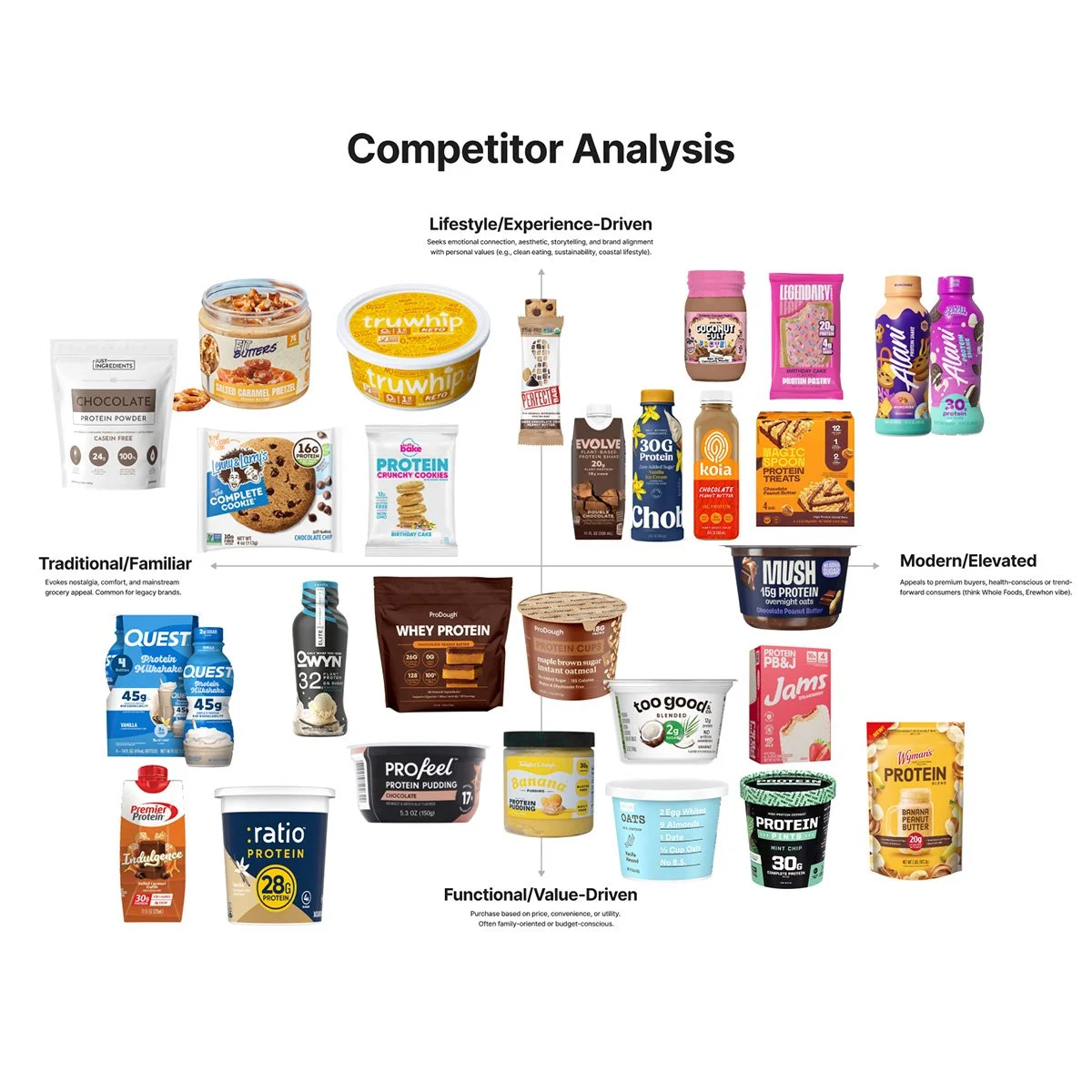
Competitor Analysis
Competitor analysis plotted on a strategic quadrant to benchmark key players across the market landscape.
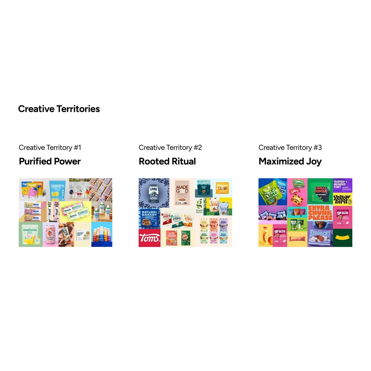
Creative Territories
Strategic creative territories developed to define distinct concept directions and guide the design exploration.
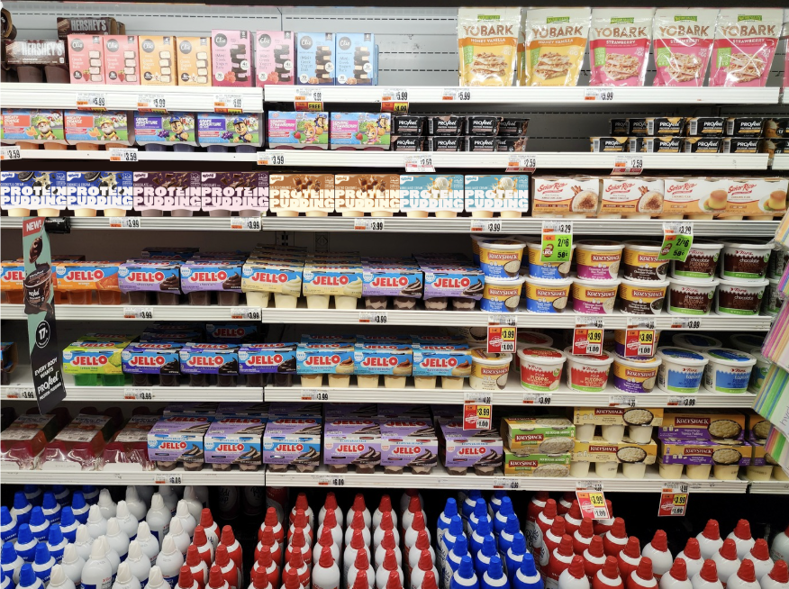
Shelf Audit
A Kroger shelf audit was conducted and revealed a competitive landscape that leaned heavily on bold design and flavor-forward imagery. Winky's approach stood apart which was better aligned with the brand personality and the expectations of its target consumer.
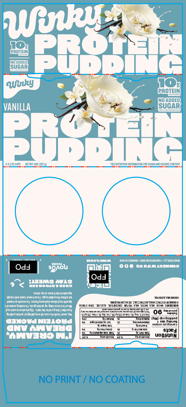
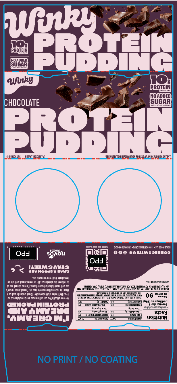
Dielines
Working dieline demonstrating final print layout — fold lines, bleed, and safe zones confirmed production-ready.